Total by default includes 2 different mobile menu styles to choose from. Below are the instructions for selecting your mobile menu style and also screenshots for examples of what they each look like.
Selecting Your Mobile Menu Style
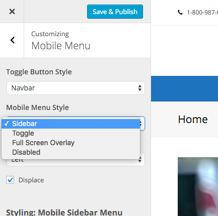
To select your mobile menu style simply log into your WordPress dashboard then go to Appearance > Customize > Header > Mobile Menu. Here you will be able to select your preferred style from a dropdown.
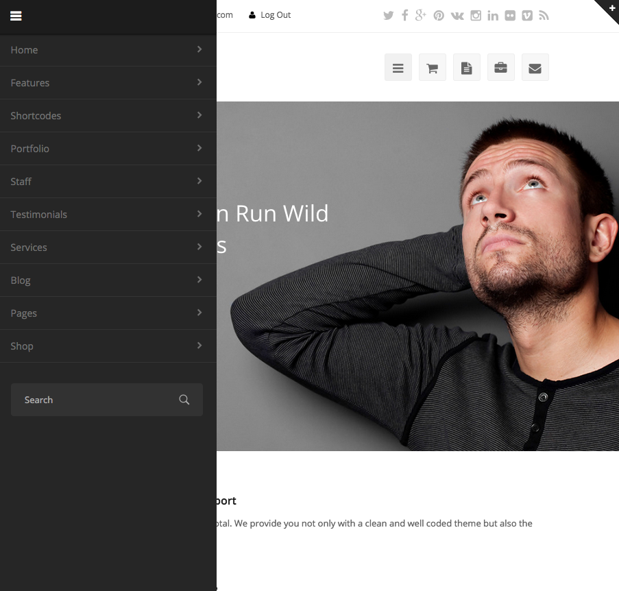
Sidebar Mobile Menu (sidr)
This is what the “Sidebar” mobile menu style looks like by default:
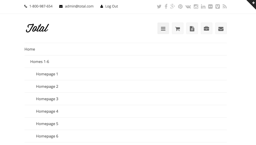
Toggle Mobile Menu
This is what the “Toggle” mobile menu style looks like by default:
Full Screen Overlay Mobile Menu
The Full-Screen overlay mobile menu is great for smaller menus and is more “modern”. You can choose between a light or dark version. Below is a screenshot example:
Mobile Menu Toggle Styles (Changing the button you click to open the mobile menu)
Have a look at the following guide to learn about the Mobile Menu toggle styles and how to change them.


